GRAPHICS CREATION & PRINT-READY ARTWORK PREPARATION
“we need cohesive branding. can you make it work throughout our marketing campaign?”

PROBLEM
AFC Foods’ marketing campaign was built around a Japanese cuisine concept called ‘Washoku’.
The word combines wa (harmony or “Japan”) and shoku (food or eating).
At inception, AFC had little more than the food concept itself, so they needed visuals to support their innovative campaign. All graphics required consistent brand treatment: colors, identity, imagery, and typography—applied uniformly across the entire project.
Design Constraints:
Logo adapted across multiple applications
Create and use the Japanese character “Washoku’ through the visuals
Outline the solution: development of a full visual system with color palette, logo/identity, imagery, typography, and layout rules.
Partner graphics with Sanrio & Hello Kitty for marketing campaign
DESIGN SOLUTION & DELIVERIES
RESULT:
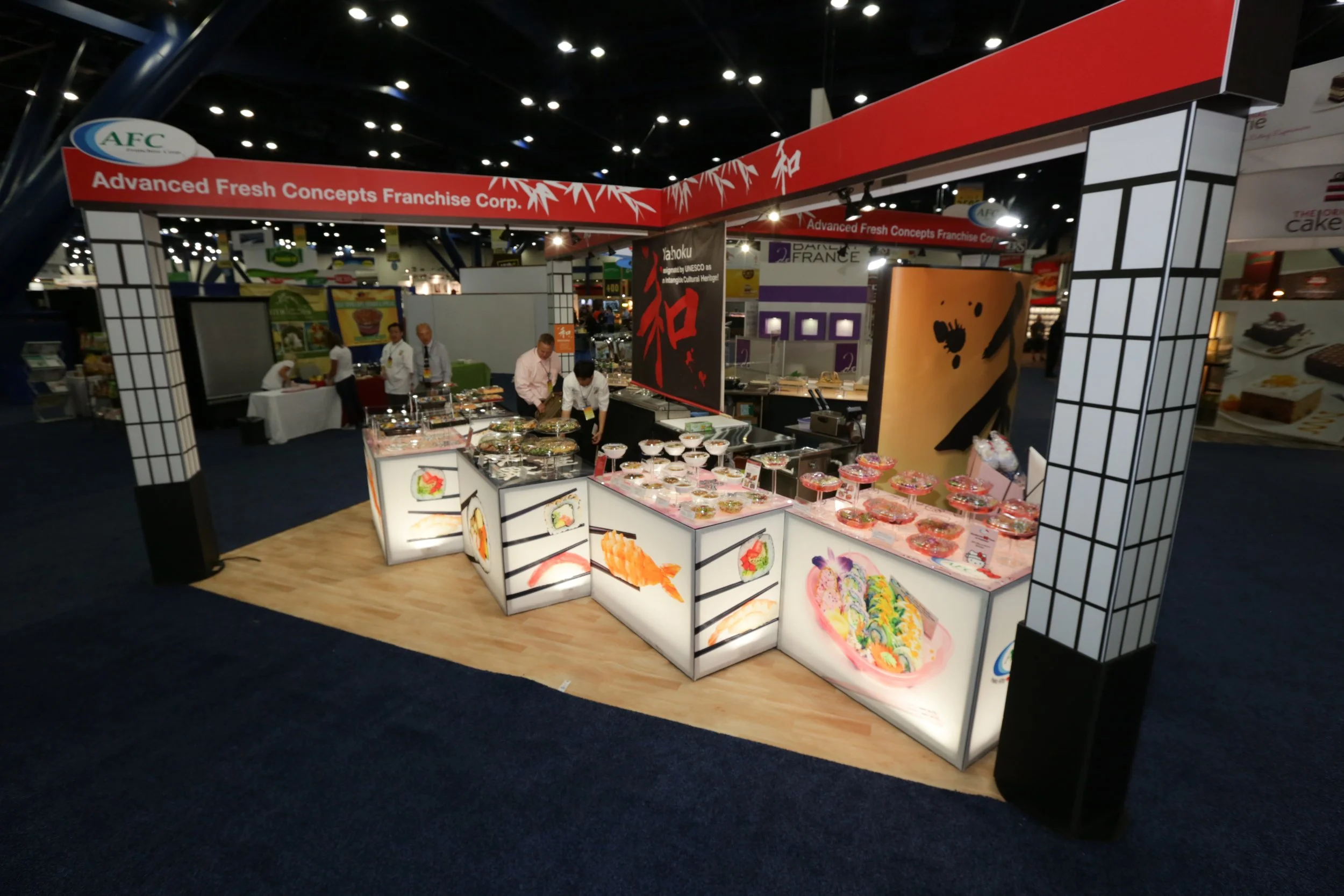
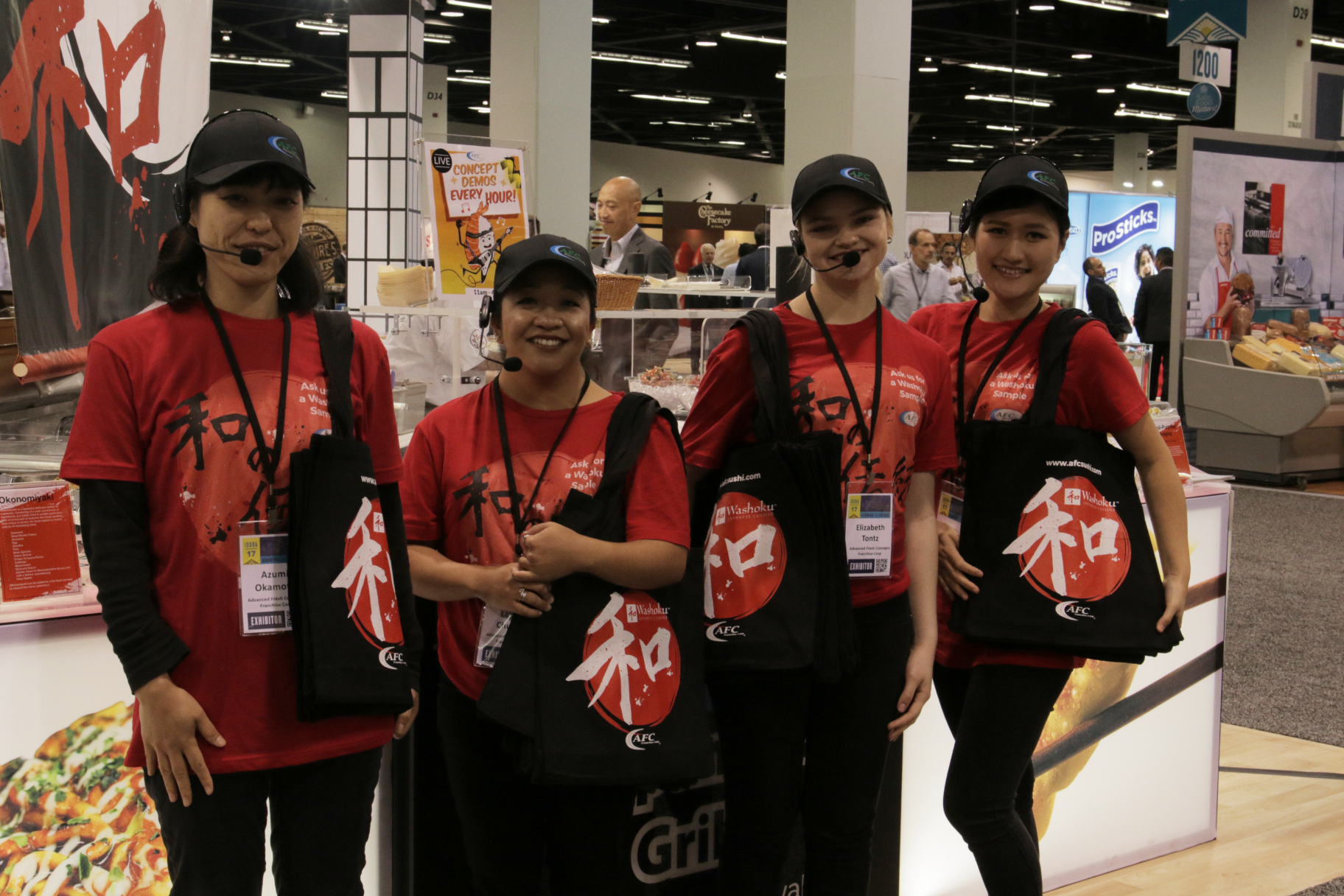
Print • Web • Signage • Apparel • Trade show
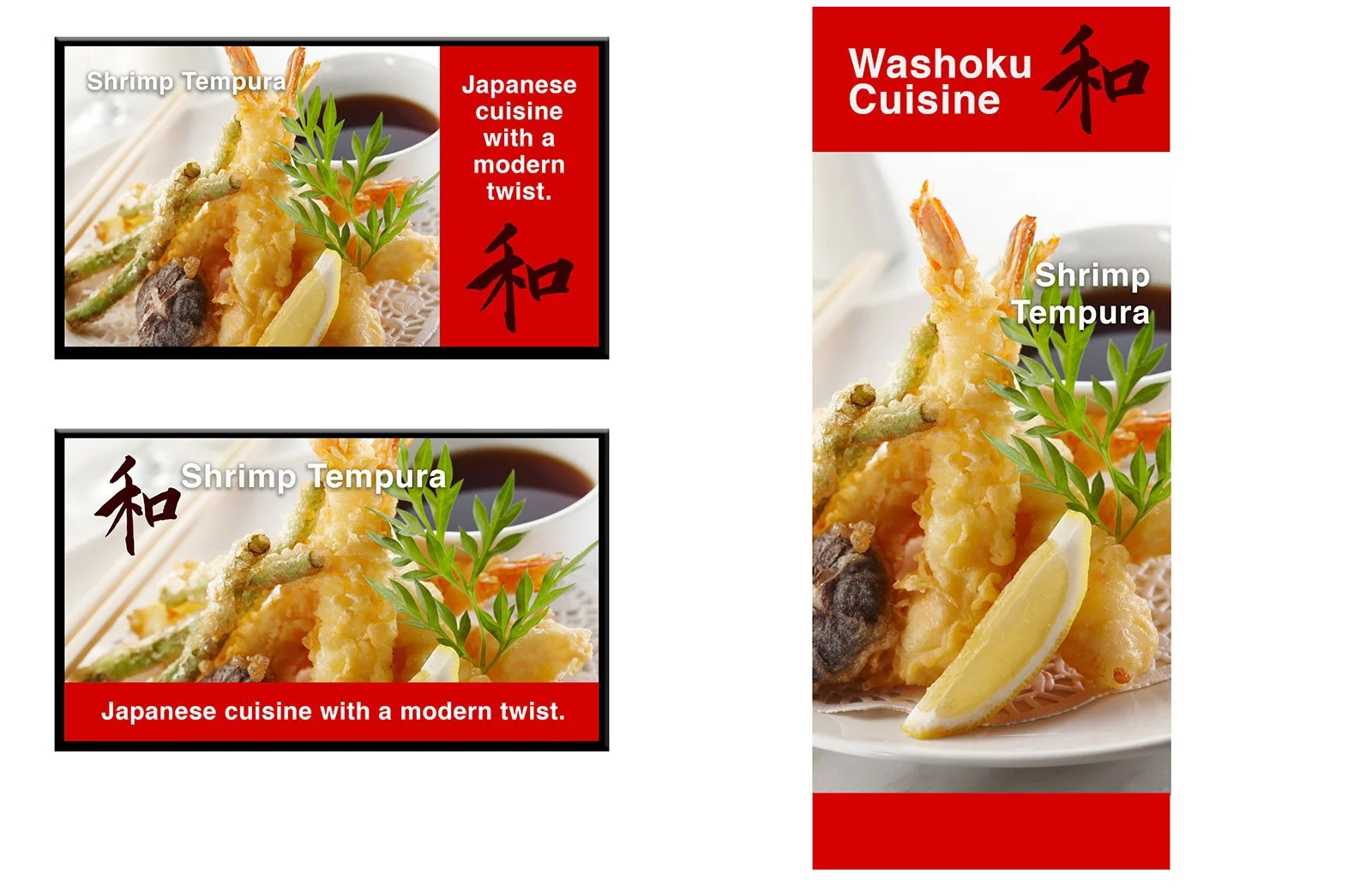
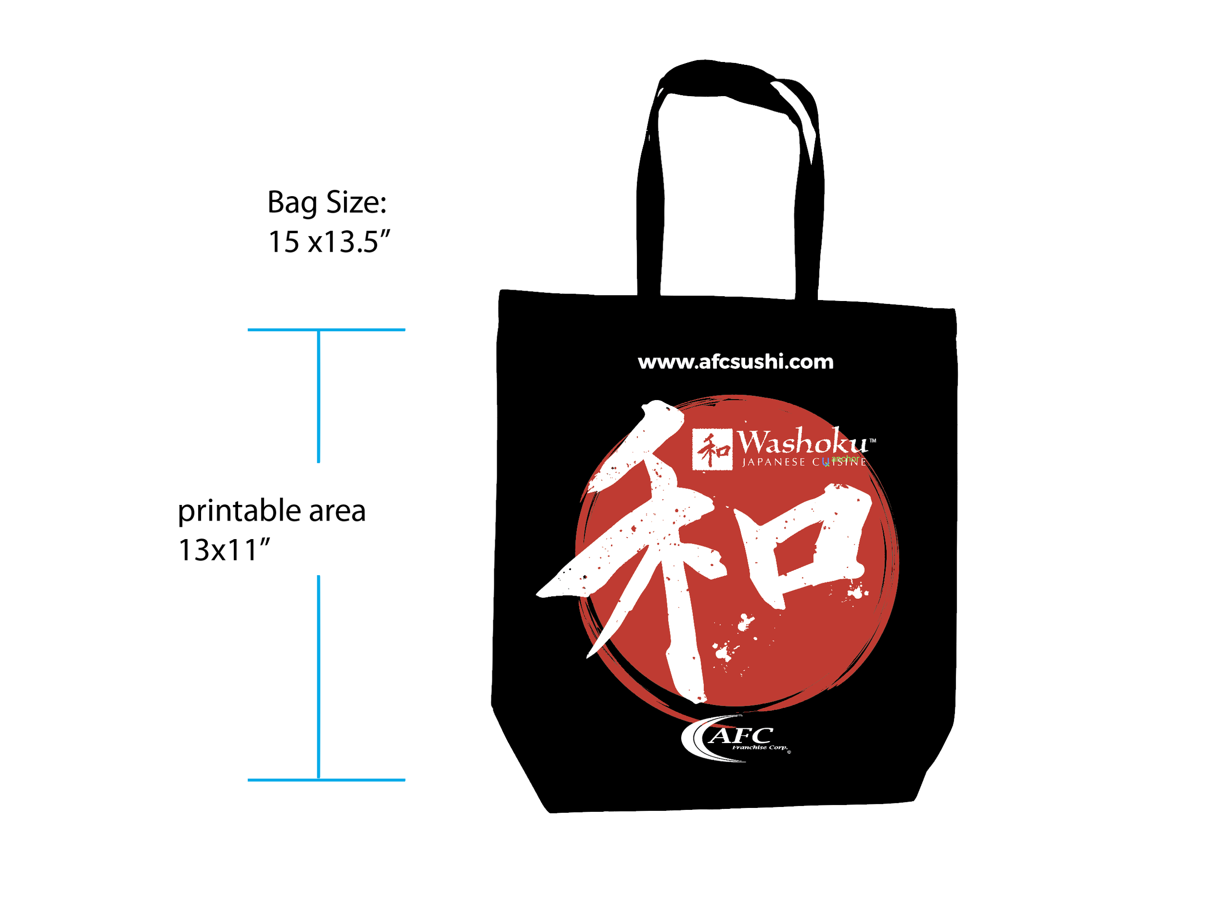
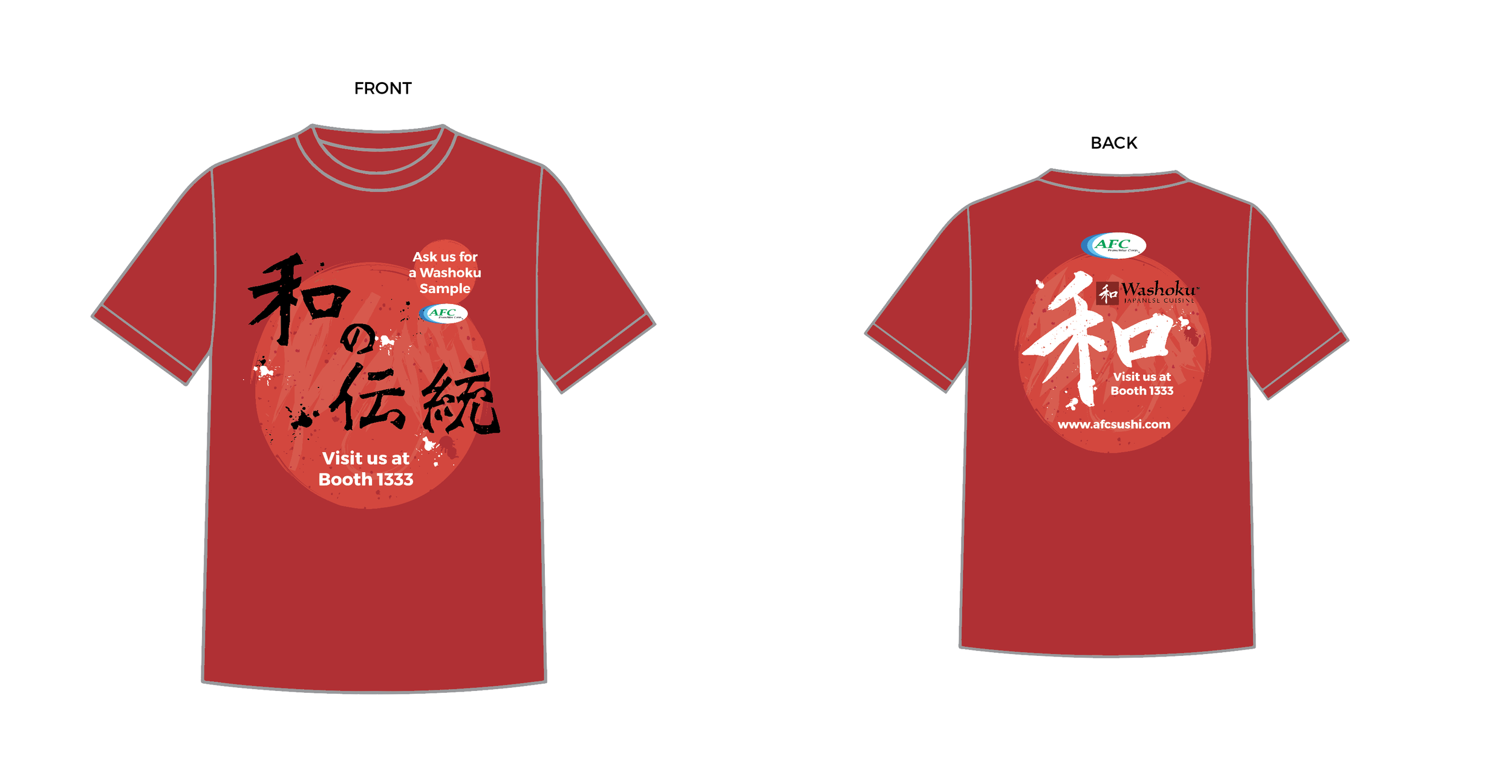
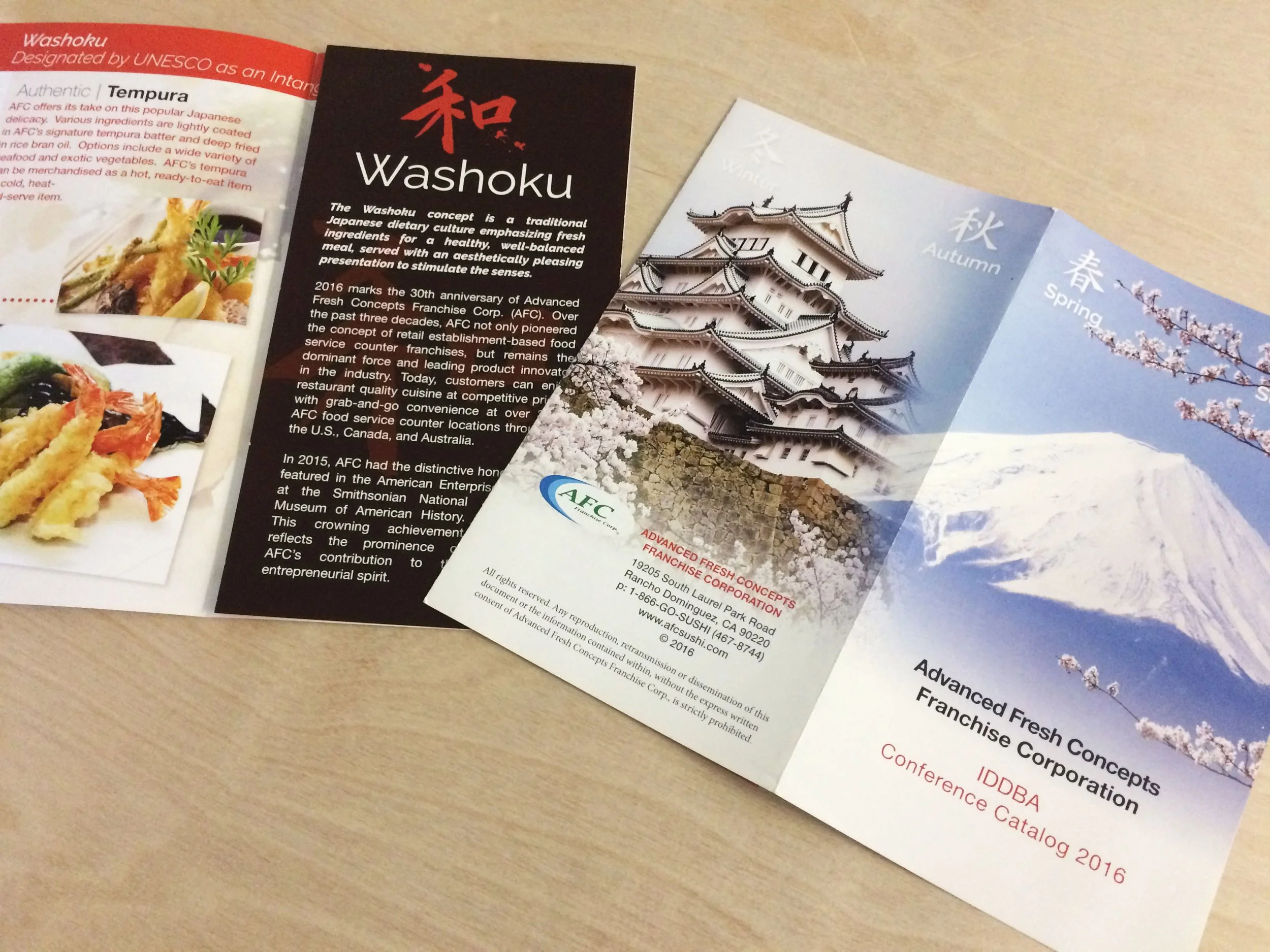
Final printed pieces: Promotional posters, Brochures, pullup banners, T-shirts & Tote bags
TV monitor graphics
Digital PDF booklet
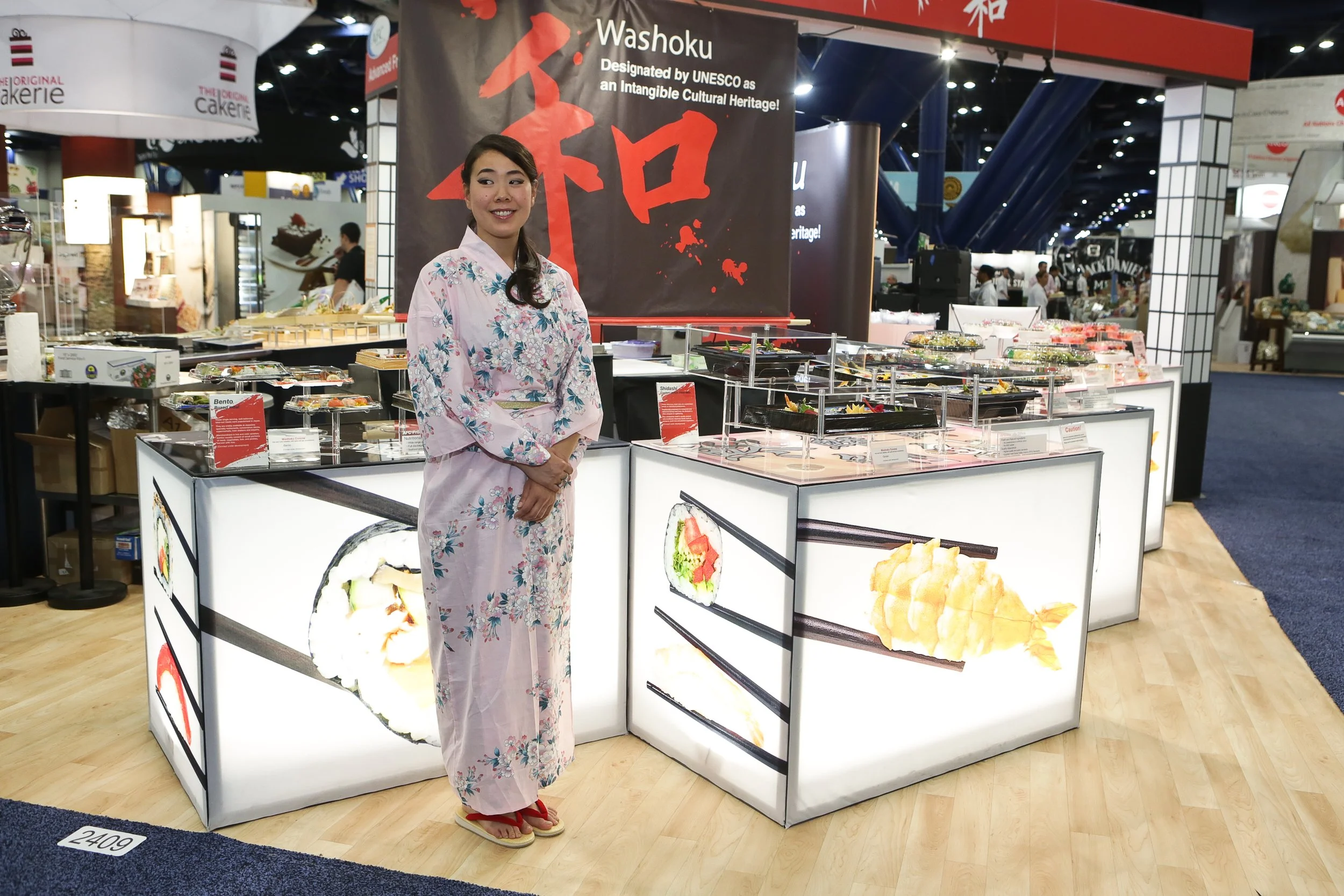
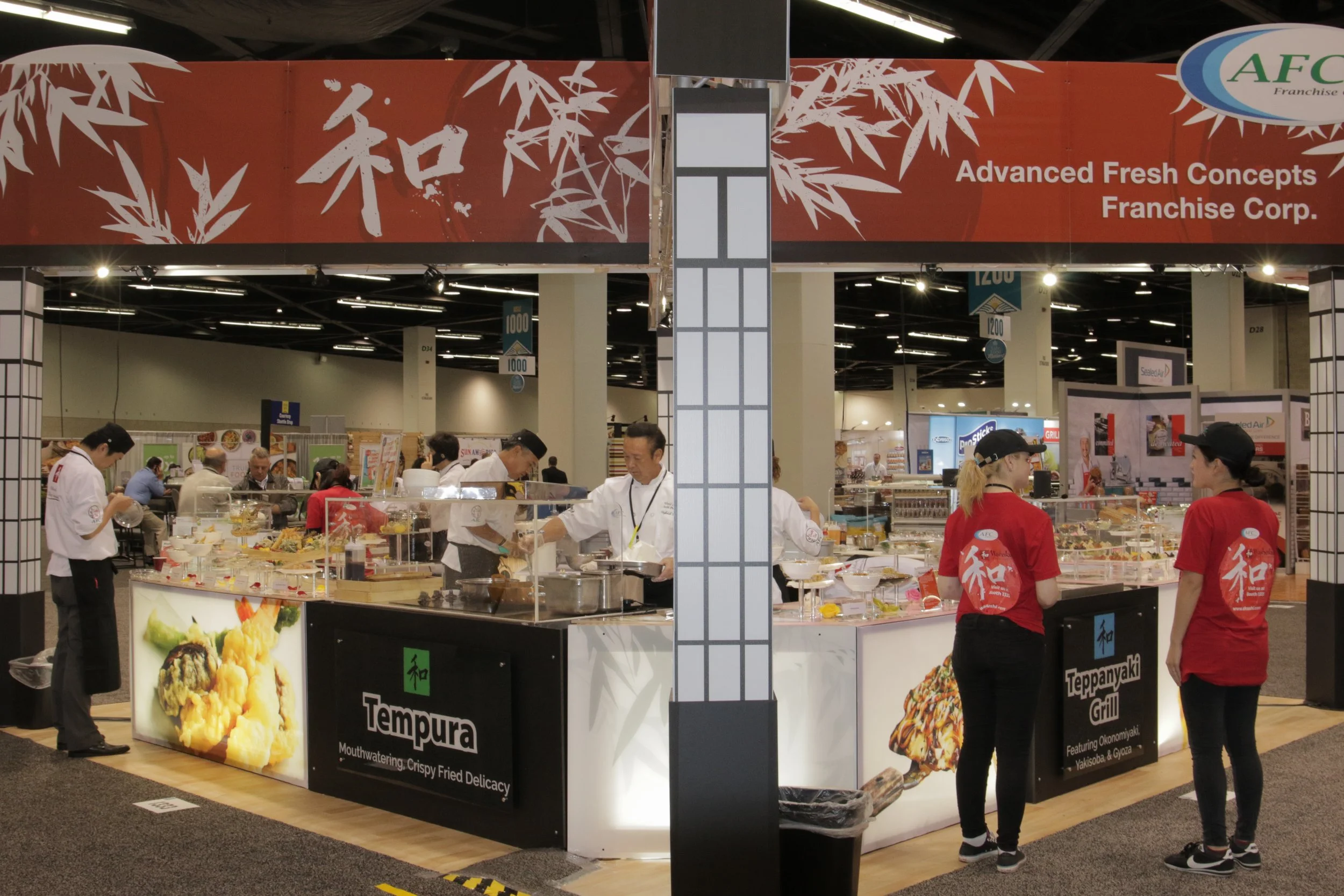
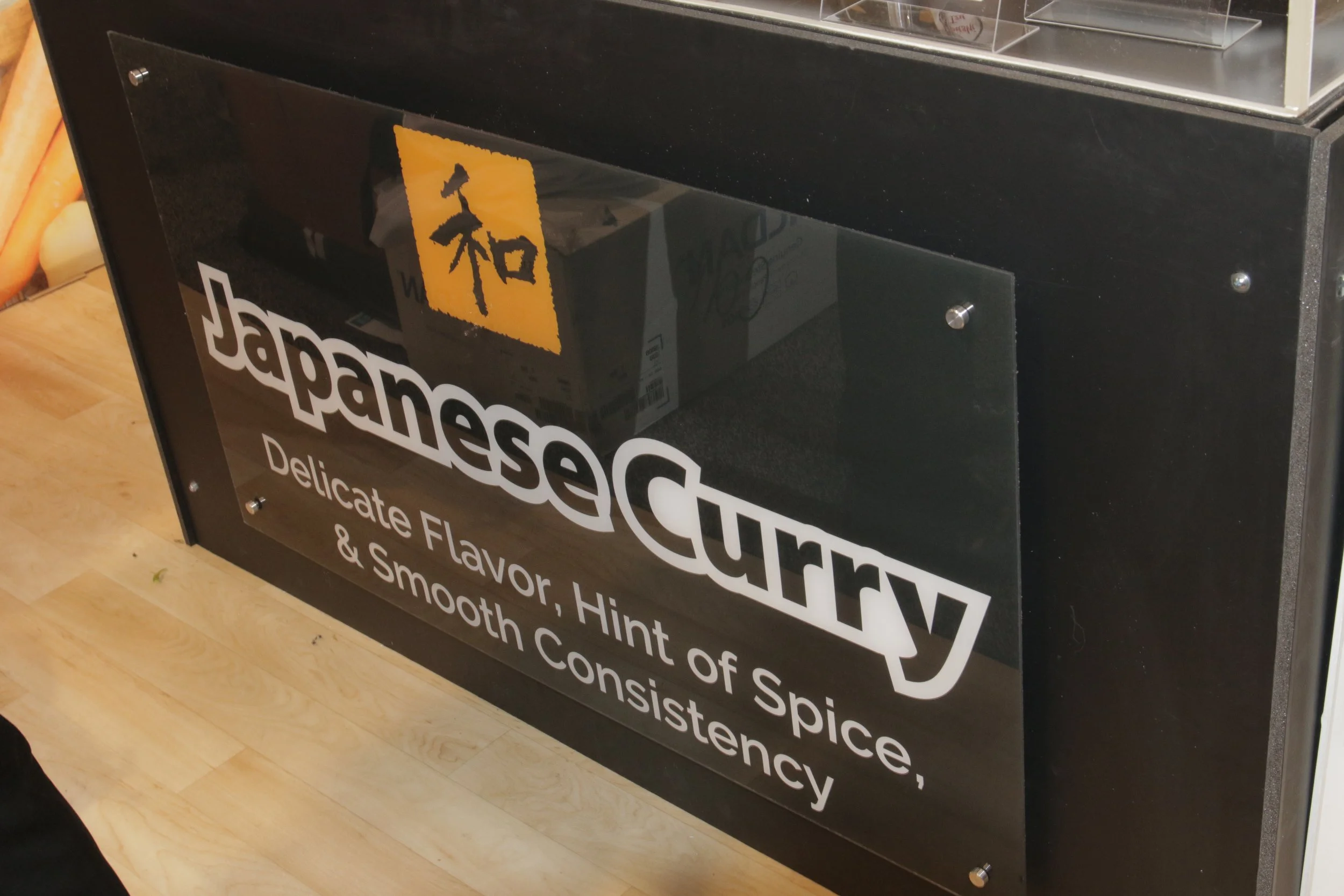
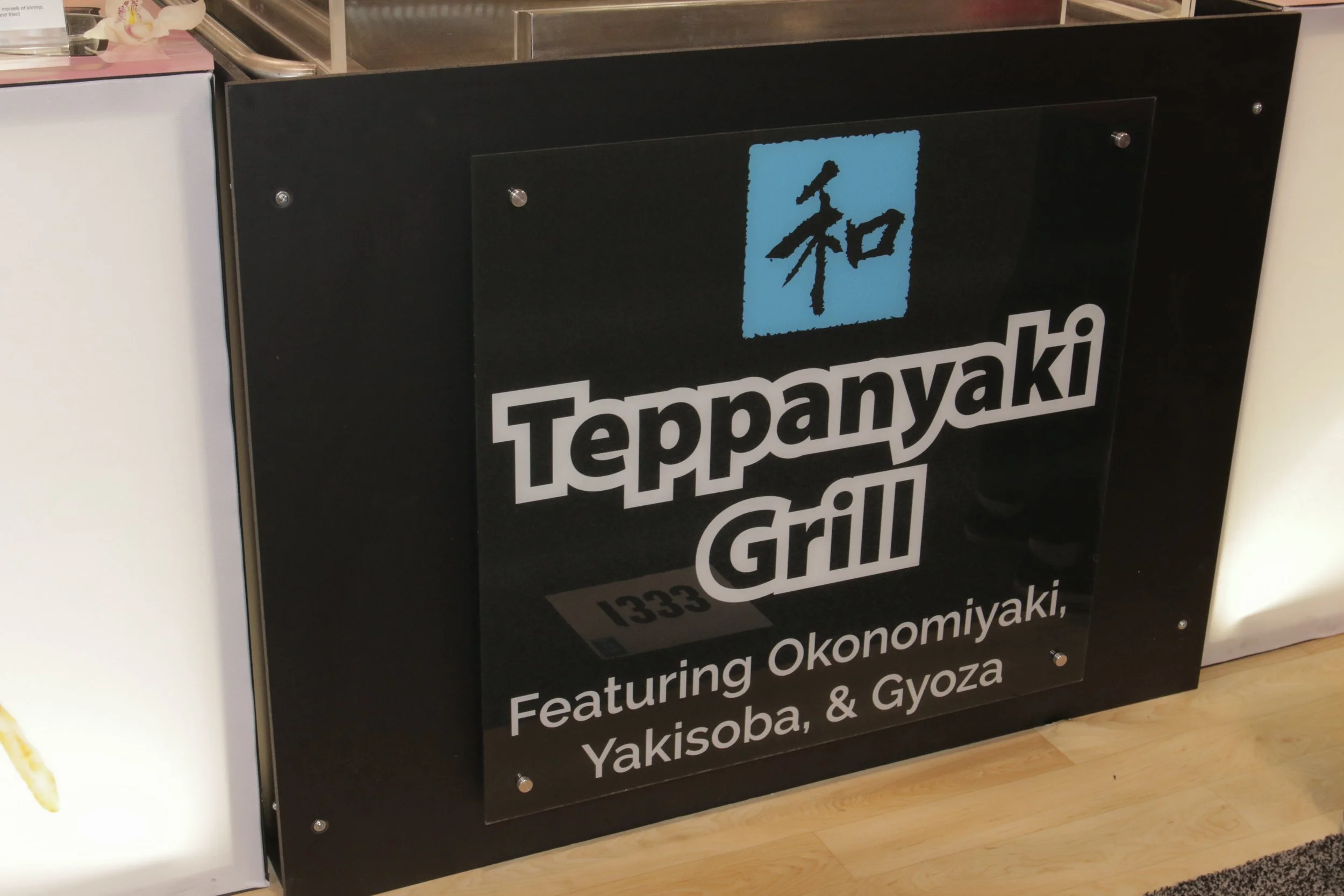
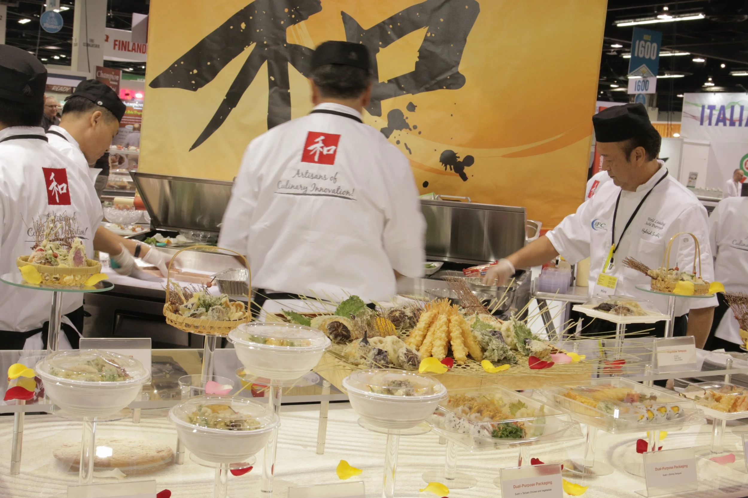
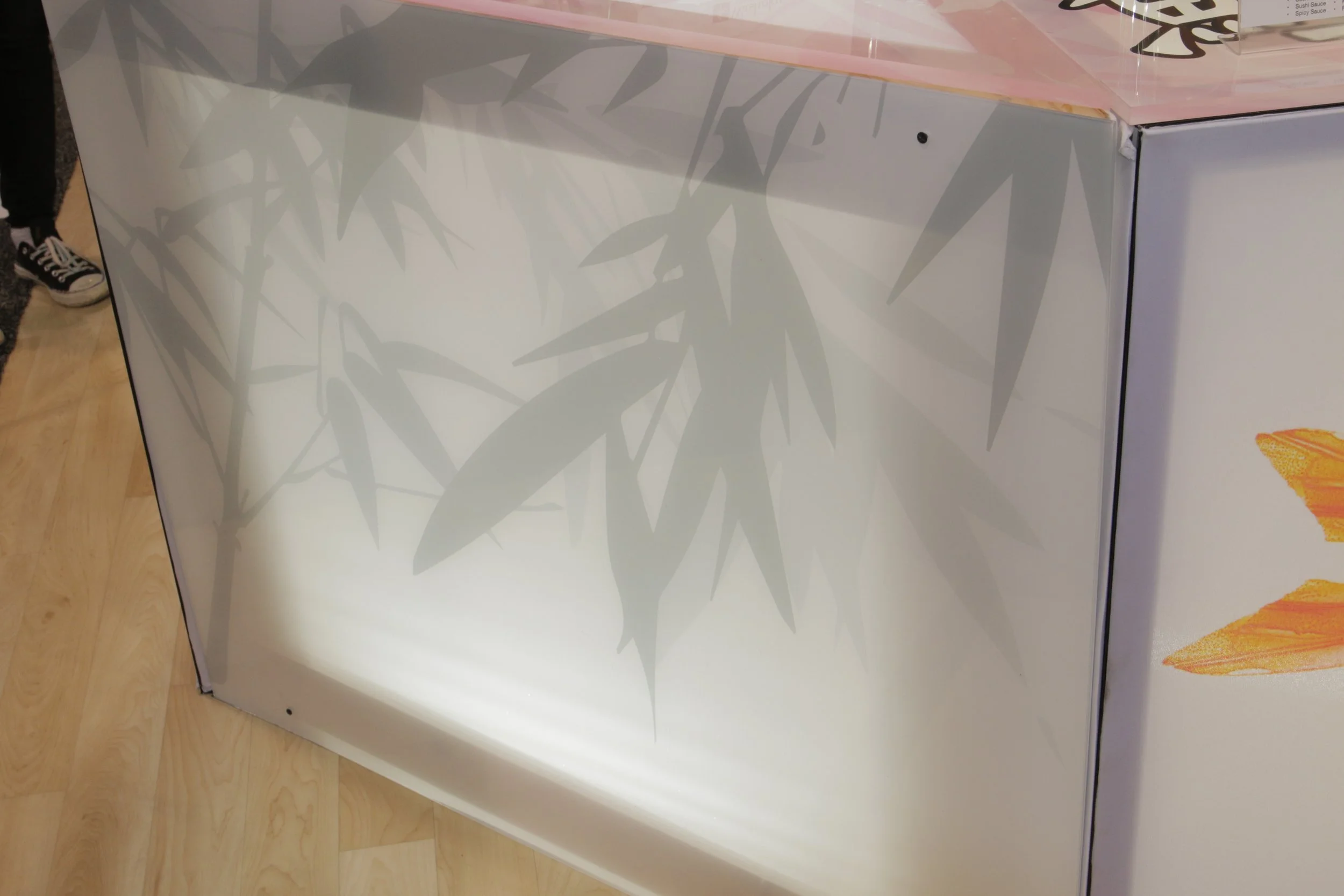
Trade show layouts & graphics
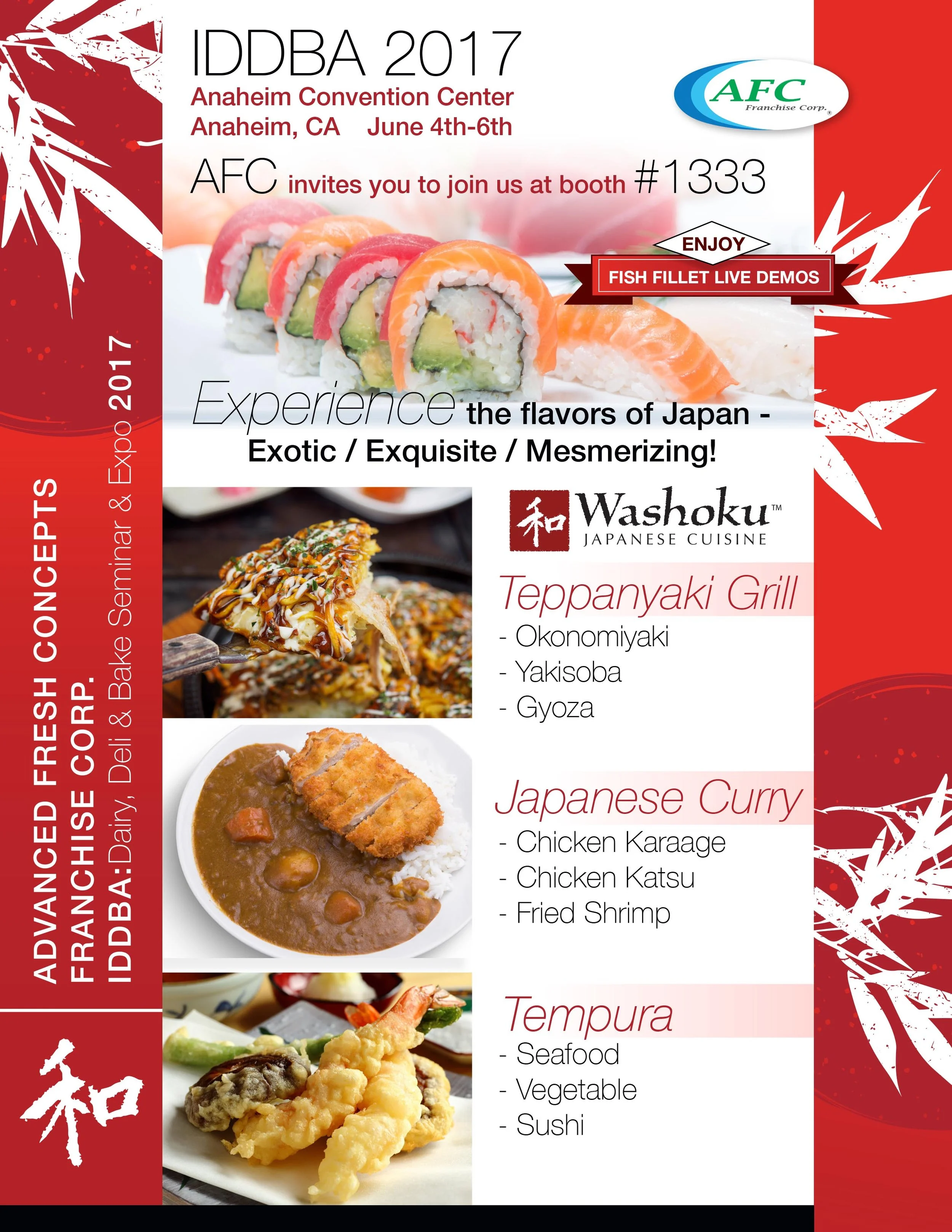
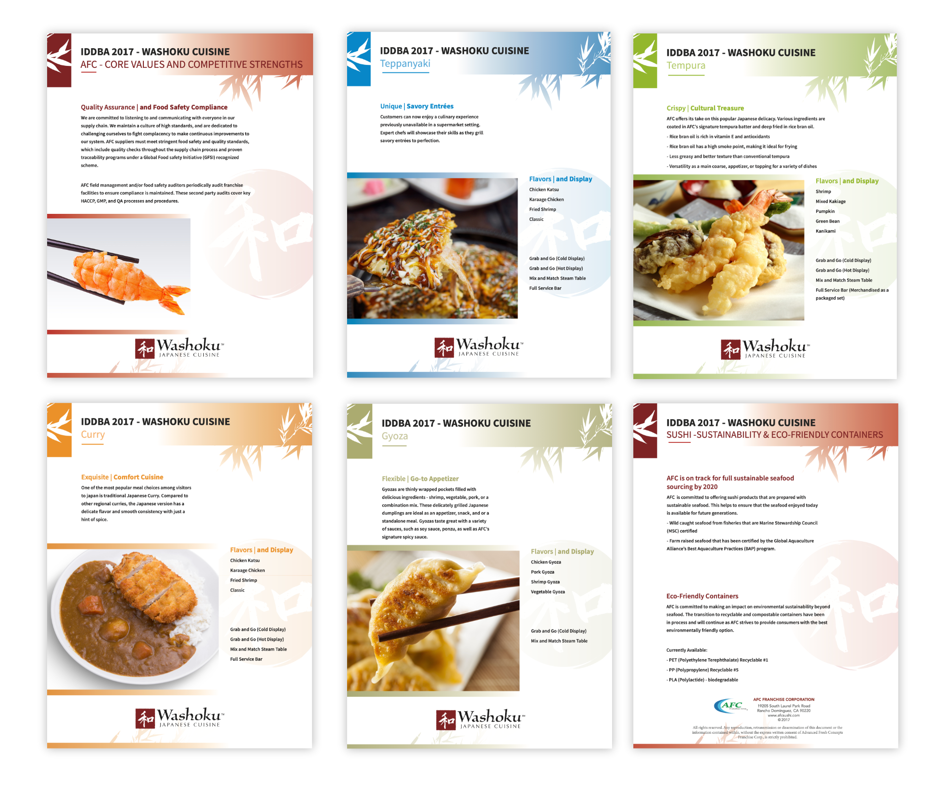
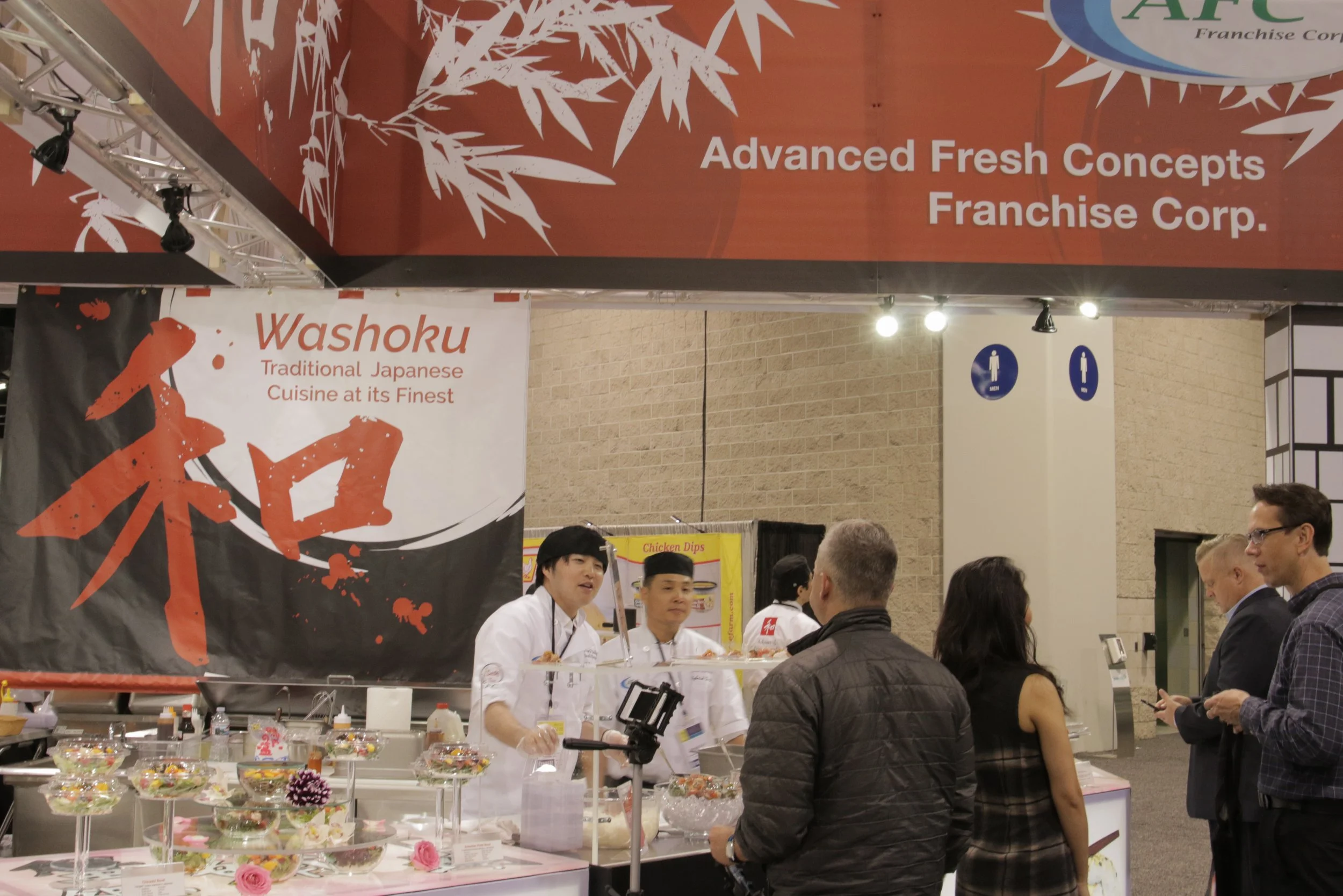
Washoku Trade show graphics and designs throughout the project